Kroger: Coupon Experience
Discovery
Within Kroger's mobile app, analytics show that coupons are the most consistently used feature. Coupon users typically fall into one of two segments: (1) people who prefer to shop for groceries first, then see what coupons are available for items in their cart or (2) people who browse coupons first, then build their cart around coupons they find. We realized there was an opportunity to bridge the gap between these two kinds of shopper by allowing the user to browse coupons and product at the same time. This would alleviate the amount of context switching users performed between searching and browsing, and alleviated the need for users to conform to one shopping style over another.
After a wireframe prototype for adding product to coupons had tested well with users, my role was to explore visual/interaction design for coupons with the new information architecture in mind.
Initial coupon experience
Methodology
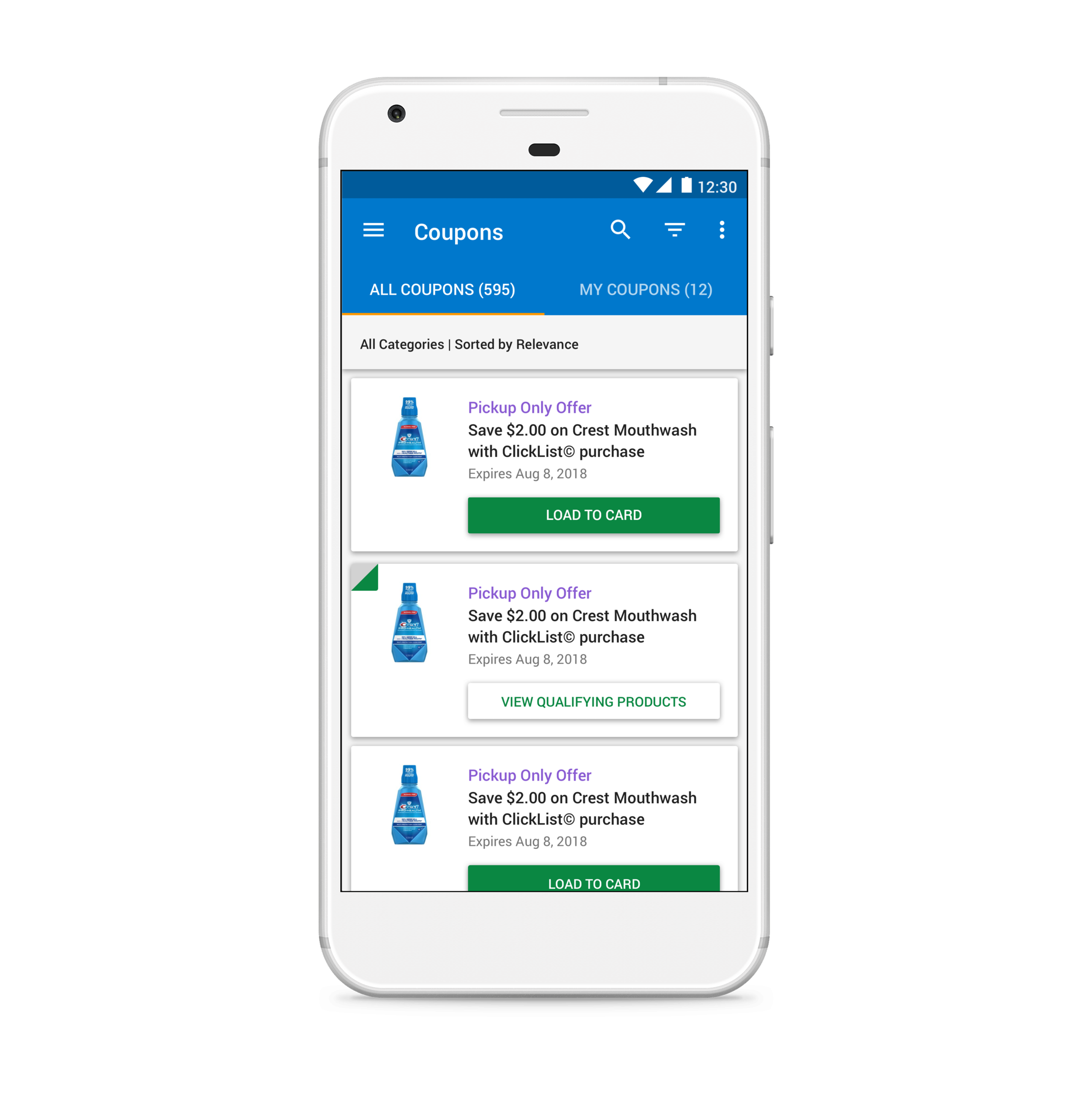
As seen in the screenshot of the previous coupon experience above, there were design problems created by the new IA that needed to be solved for: (1) The "Coupon on Card" confirmation message needed to be replaced with a CTA that read "View Qualifying Items". (2) Users still need some sort of indication that a coupon had been loaded to their loyalty card. The amount of real estate within the coupon card component made ideation challenging. I wanted the state change between loading and confirmation to be noticeable enough to inform a user that they could take further action.
Also, with the "Coupon on Card" text potentially being removed, I explored alternate ways to indicate that a coupon had been loaded; the indicator needed to be subtle, yet distinct enough to stand out from coupons that had not been loaded.
Solution & Outcomes
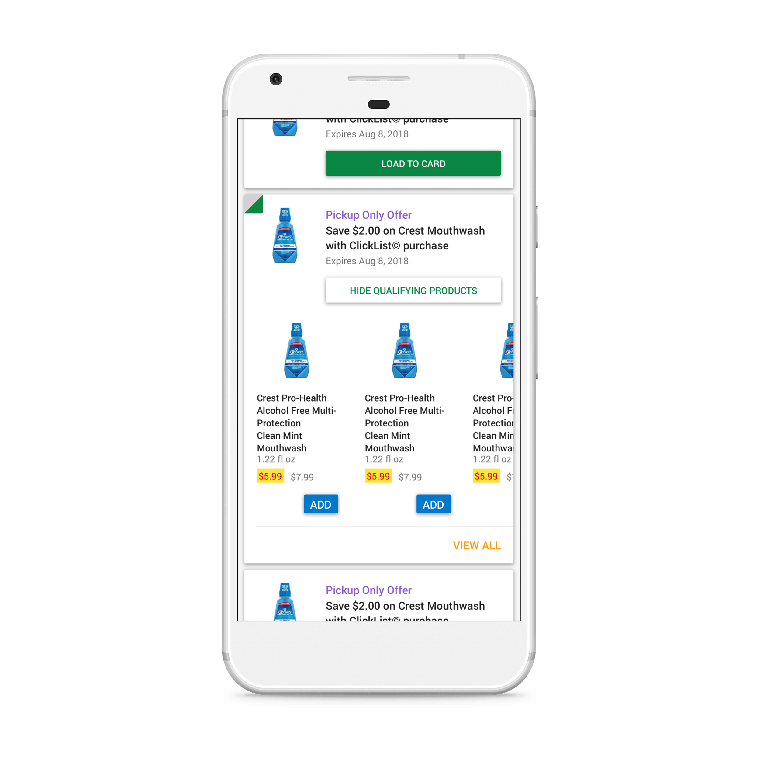
The final direction uses a "dog ear" component in the corner of the coupon card, signifying to a user that a coupon has been loaded. Once "Load to Card" is tapped, its state changes to "View Qualifying Products", launching a carousel experience that enables a user to view products associated with the coupon added. Taken together, this created a system for users to be able to view coupons and shop within the same experience, resulting in an increase in average order value.


